Rogers Bank
Redesigning Rogers Bank to utilize the Rogers Design System.
Rogers Communications Inc.
My Design Process
〰️
My Design Process 〰️
1
2
3
4
5
the design challenge
1
PROJECT OVERVIEW
Rogers Bank, part of the Rogers Communications family since 2013, delivers value by rewarding customers and turning everyday spending into meaningful opportunities.
As part of the Rogers ecosystem, the main goal for the Rogers Bank website is to adopt the Rogers Design System. This integration establishes a consistent, accessible, and scalable design foundation. My role focuses on implementing this system to create a cohesive visual language and a seamless user experience, ensuring the bank's online presence aligns with Rogers' broader design principles.
TEAM CREDITS
Product designer: Navi Hothi
Technical team lead: Ben C.
Design system team lead: Joanna S.
Product manager: Ryan K.
GOAL(S)
Since Rogers Bank is part of the Rogers family, the goal was for the website to adopt the Rogers UI component library, also known as the Rogers Design System. Implementing this system would create a consistent, accessible, and scalable foundation for the site. My main objective was to fully integrate the Design System into the Rogers Bank website, ensuring a cohesive and unified visual design language that aligns seamlessly with the broader Rogers digital presence.
Consistency
It creates one source of truth across all products.
Accessibility
Ensuring all types of users and interact with our product.
Scalability
Promotes efficiency for evolving organizations and products.
THE PROBLEM
The Rogers Bank website lacked a cohesive and consistent design pattern compared to the Rogers website. To address this, I conducted a full audit of the site to identify any visual or UX inconsistencies and recommend changes. In cases where UI components didn’t exist in the Rogers Design System, I created new ones that followed the system’s standards. This ensured the website had a unified and seamless design, aligning it with the overall look and feel of Rogers’ digital presence.
I framed the main problem statement as:
How might we utilize the existing components in the Rogers Design System library while aligning with the current design of the Rogers Bank website?
CONSTRAINTS
The biggest constraint in this redesign was that I worked as the sole designer. While it was nice to have creative control, I didn’t make all the design decisions completely on my own. The Design System team lead was there to guide me, approving my work or suggesting improvements when needed. Having her feedback made sure my designs fit within the system's standards, but I still got to lead the creative direction, which was super rewarding even though it came with its own set of challenges.
The project had a tight turnaround time—I started the audit in mid-November 2023 and finalized my recommendations for the redesign by the end of the year. My responsibilities included conducting the audit, creating quick mock-ups to present to stakeholders, and integrating their feedback into the designs. I carefully evaluated all input to ensure only the most relevant changes were implemented, balancing stakeholder expectations with maintaining the integrity of the redesign.
research & audit
2
CURRENT WEBSITE ANALYSIS
Following Nielsen’s Heuristics, I identified several usability issues, their impacts, and recommendations for improvement. Each issue was assessed for its effect on user experience and prioritized based on its severity. My recommendations aim to align the interface with established usability principles, improving overall accessibility and efficiency for users.
Consistency and Standards
1
Issue: The Rogers Bank website lacked a cohesive and consistent design pattern compared to the Rogers website.
Impact: Users may experience confusion or frustration when interacting with the site due to inconsistent UI elements.
Recommendation: Implement the Rogers Design System across all pages to ensure visual and functional consistency.
Issue: The placement of critical credit card information (e.g., card fees and welcome bonus) was counterintuitive, making it harder for users to find essential details quickly.
Impact: Misaligned content hierarchy can lead to users missing critical information.
Recommendation:Prioritize important information at the top of the page, ensuring it aligns with user expectations.
Match Between the System and the Real World
2
Aesthetic and Minimalist Design
3
Issue: The visual language on the website was cluttered and lacked a clear hierarchy, especially on product pages.
Impact: Overwhelming layouts can hinder users' ability to focus on key benefits or CTAs.
Recommendation: Streamline layouts using the design system's value props and other consistent components to emphasize key benefits and CTAs.
Visibility of System Status
4
Issue: Some interactive elements, such as the calculator and credit card comparison table, were not clear or accessible.
Impact: Lack of feedback or clarity in functionality can lead to user frustration
Recommendation: Streamline layouts using the design system's value props and other consistent components to emphasize key benefits and CTAs.
Flexibility and Efficiency of Use
5
Issue: Navigation elements (e.g., FAQ and article pages) lacked sufficient categorization and search functionality.
Impact: Our users may struggle to find the information they need quickly.
Recommendation: Introduce a search function and categorize content using tabs to enhance usability and efficiency.
Error Prevention
6
Issue: The FAQ page included a back button, which may confuse our users arriving from search engines.
Impact: Users could inadvertently return to an irrelevant page or feel disoriented.
Recommendation: Remove the back button or replace it with clear navigation options tailored to the user’s entry point.
Help and Documentation
7
Issue: The website did not provide sufficient support for users seeking additional assistance (e.g., through chat or FAQs).
Impact: Limited help options can lead to users abandoning tasks or seeking support elsewhere.
Recommendation: Implement the Rogers Design System throughout the site to ensure uniformity in both visual and functional elements, aligning the bank’s interface with Rogers’ standards.
COMPETITOR ANALYSIS
For the redesign of the Rogers Bank website, the research phase primarily involved competitor analysis. I looked into a mix of larger banks like TD, CIBC, and American Express, as well as smaller companies like PC Financial, Canadian Tire Bank, and Tangerine.
I reviewed how these financial institutions showcased and compared their credit card offerings, examining the formats they used and the key information they displayed. This provided insights into effective ways of presenting credit card details in a clear and user-friendly manner, which helped inform the design direction for the Rogers Bank site.
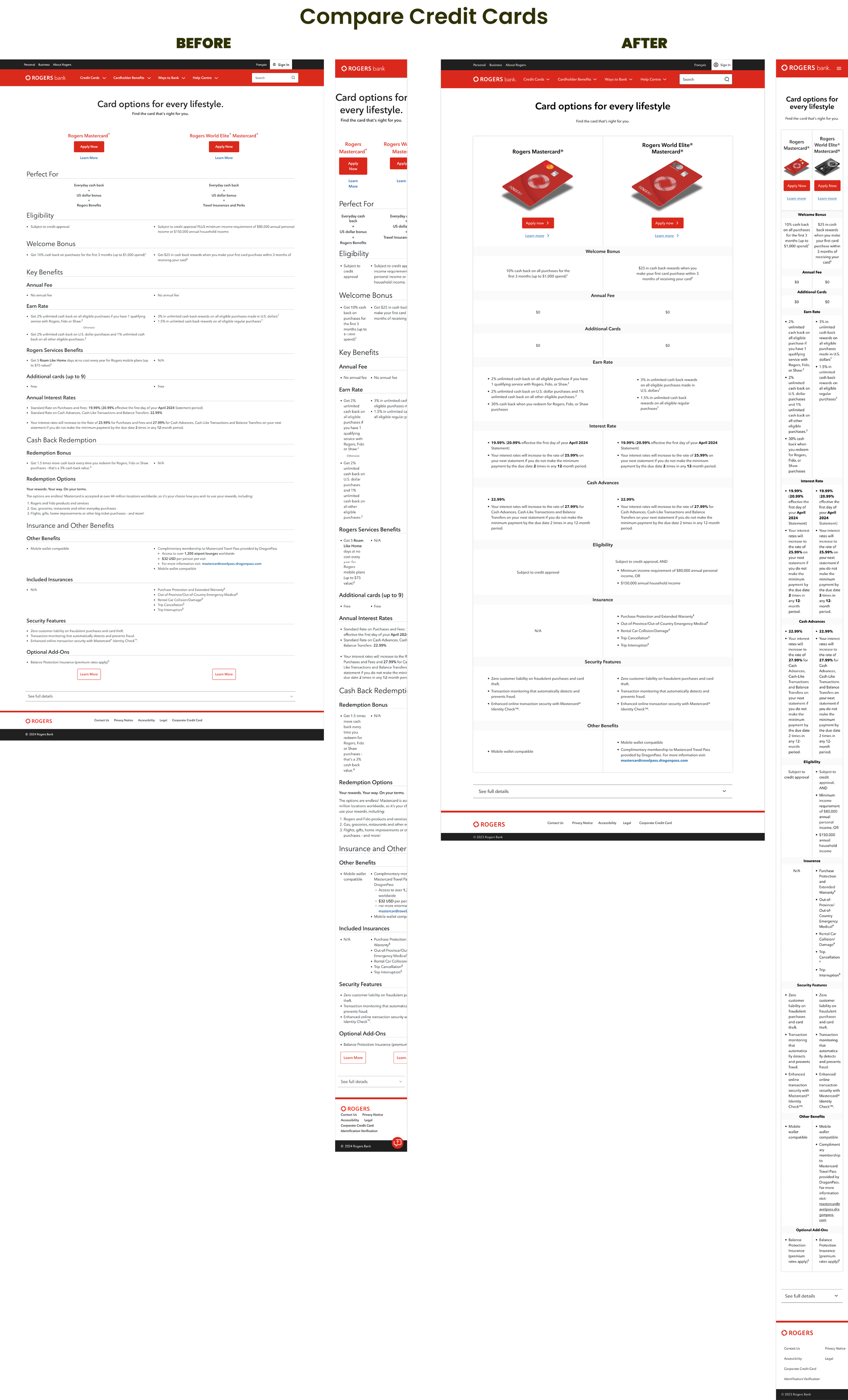
Rogers Bank initially displayed their credit card fees at the bottom of the page, even though this information is crucial for customers deciding whether to apply. At first, I thought about creating a new component, but with limited developer resources and tight timelines, I decided to utilize an existing component from the design system instead.I then repositioned the fee details closer to the top of the page. This adjustment made essential information more accessible, improving the user experience and supporting customers in making well-informed decisions.
redesign strategy
3
DESIGN GOALS
The primary goal of this redesign was to deliver a cohesive, consistent, and accessible user experience by fully incorporating the existing Design System into the Rogers Bank website. This effort focused on:
Enhance Visual Consistency: Establish a unified design language across all pages, aligning the website with the broader Rogers brand.
Improve Accessibility: Use Design System components to meet accessibility standards, ensuring inclusivity for all users.
Streamline Scalability: Build a flexible foundation for easier updates and future features.
Optimize Usability: Simplify navigation, improve content hierarchy, and make important information more intuitive.
Facilitate Team Collaboration: Leverage Design System patterns to create workflows that enable efficient teamwork across functions.
DESIGN PRINCIPLES
The redesign was focused on principles that prioritized our users’ needs and business goals. These principles helped me keep the design consistent, clear, and easy to understand. By following this approach, I was able to ensure the final product was both user-friendly and aligned with the company's objectives.
User-Centered Design: I focused on understanding our users' needs, behaviors, and challenges. Every decision was backed by research, usability testing, and analytics to create an experience that feels natural and truly supports the user.
Mobile-First Approach: Recognizing that many users access the platform on mobile devices, I prioritize designing for smaller screens first. This ensures the experience is seamless across all devices, focusing on clarity and usability no matter the screen size.
Accessibility and Inclusivity: I designed with accessibility in mind, ensuring the interface is usable by everyone, regardless of ability. Since the components in the design system already meet accessibility standards, it made designing with inclusivity and accessibility in focus much easier and more efficient.
Consistency Through Reusability: Using the design system made it easy to keep things consistent across all components and interfaces. It saved development time and helped build trust with users by making the experience feel seamless and reliable.
Performance-Driven Design: We focus on making designs fast and responsive, so users have a smooth, reliable experience—even in low-bandwidth situations.
Feedback-Driven Iteration: Our designs evolve with ongoing feedback from users, stakeholders, and data. By adopting an iterative process, we continuously refine the designs to meet user expectations and improve the overall experience.
Clarity and Simplicity: Every element is intentional, with a focus on simplicity. The design avoids unnecessary complexity by prioritizing clear messaging, straightforward interactions, and an easy-to-follow navigation flow. This approach ensures the user experience is intuitive and efficient, allowing users to find what they need without frustration.
DESIGN APPROACH
To kick off the project, a design audit was conducted to evaluate all existing pages on the website. The analysis focused on identifying inconsistencies, user experience issues, and areas for improvement. The four main questions addressed were:
What elements can be standardized into reusable page templates?
What content can be migrated 1:1 using existing design system components?
What components need modification?
What new components need to be created?
What elements can be standardized into reusable page templates?
1
I categorized the different pages into six templates based on patterns I observed:
Homepage
Product pages (e.g., credit card pages)
Landing pages (standard, non-specific pages)
HUB pages (a collection of FAQ and article pages)
FAQ pages
Article pages
I also included the credit card comparison page under the product page template because it primarily focuses on comparing credit card offerings. This categorization helped streamline the design audit and identify areas for improvement across these key templates.
Other pages that had to also be considered for the redesign were:
Announcement pages
Application questionnaire pages
404 page
Search page
What content can be migrated 1:1 using existing design system components?
2
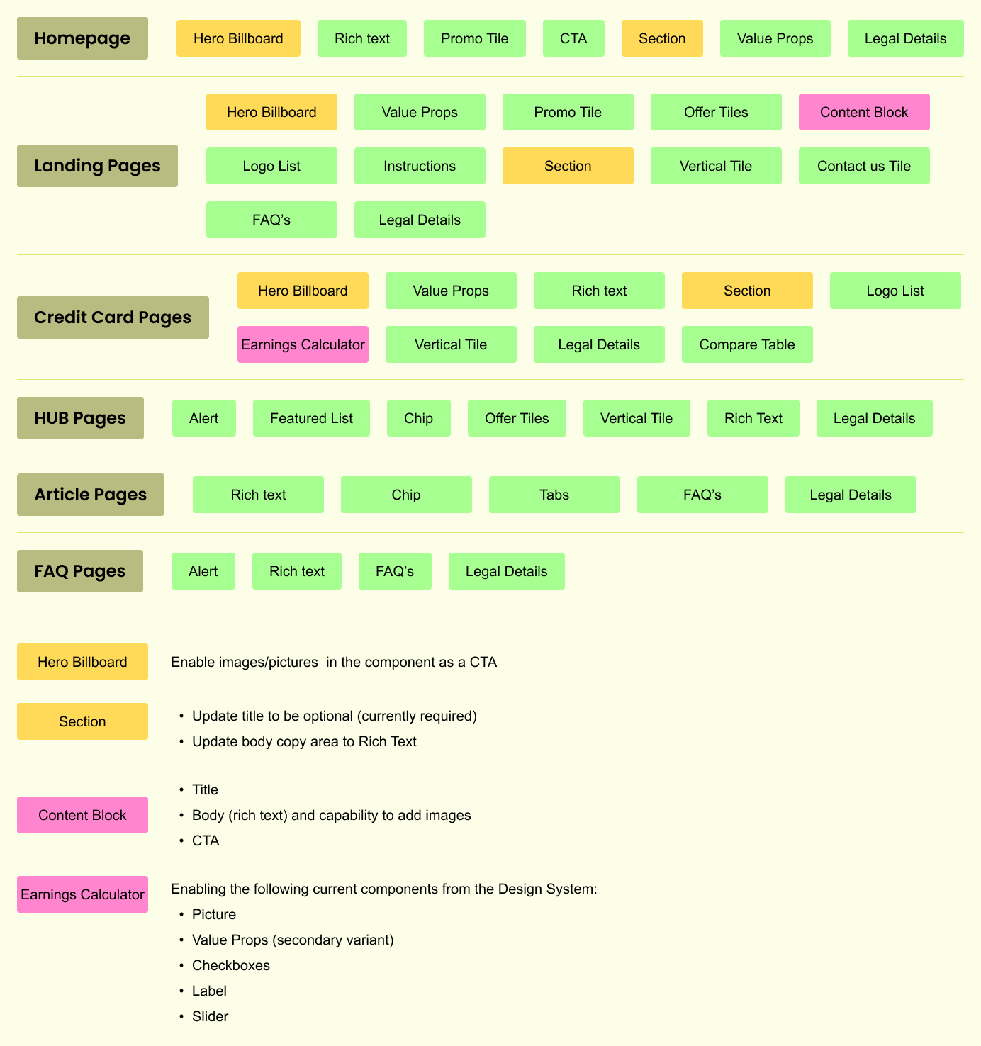
The first step I took was to:
Audit all pages – I noted which components could be replaced with existing ones from the CDK.
Document component usage – I listed the components used on each page, making notes of potential modifications.
Color-code findings:
Green: No changes needed.
Yellow: Possible modifications required.
Pink: New components needed.
What components need modification?
3
Based on the components labeled yellow, the modifications needed were:
Hero Billboard: Enable the use of images/pictures as a CTA.
Section Component:
Make the title optional (currently required).
Update the body copy field from a text area to rich text, allowing more flexibility for content formatting.
Comparison table:
Redesigned to replace the existing inaccessible table component in the CDK, ensuring better usability and accessibility.
These changes addressed the need for greater adaptability and enhanced usability across the redesigned pages.
What new components need to be created?
4
To support the redesign, several new content types and components were introduced:
Content Block: A new content type in Contentful with a title, rich text body (allowing images), and a CTA button.
Earnings Calculator: A tool on credit card pages where customers estimate their yearly earnings based on spending.
Once the audit was completed, I was tasked with creating 1–2 mock-ups of key pages to present to shareholders. I approached this in two ways:
Staying close to the current Rogers Bank website design while identifying unsupported components and highlighting areas needing modification.
Leveraging existing Rogers Design System components to deviate from the current design.
This process helped establish initial design solutions. I noticed a lack of consistent visual language across the site, and redesigning the pages aligned them with Rogers Design System patterns.
The shareholders acted as key stakeholders. I presented mock-ups every two weeks, starting with categorized templates, incorporating feedback (which was largely positive), and progressively building out remaining pages.
The next section will showcase this process with before-and-after examples of the designs.
design solutions
4
REDESIGNED PAGES
Homepage
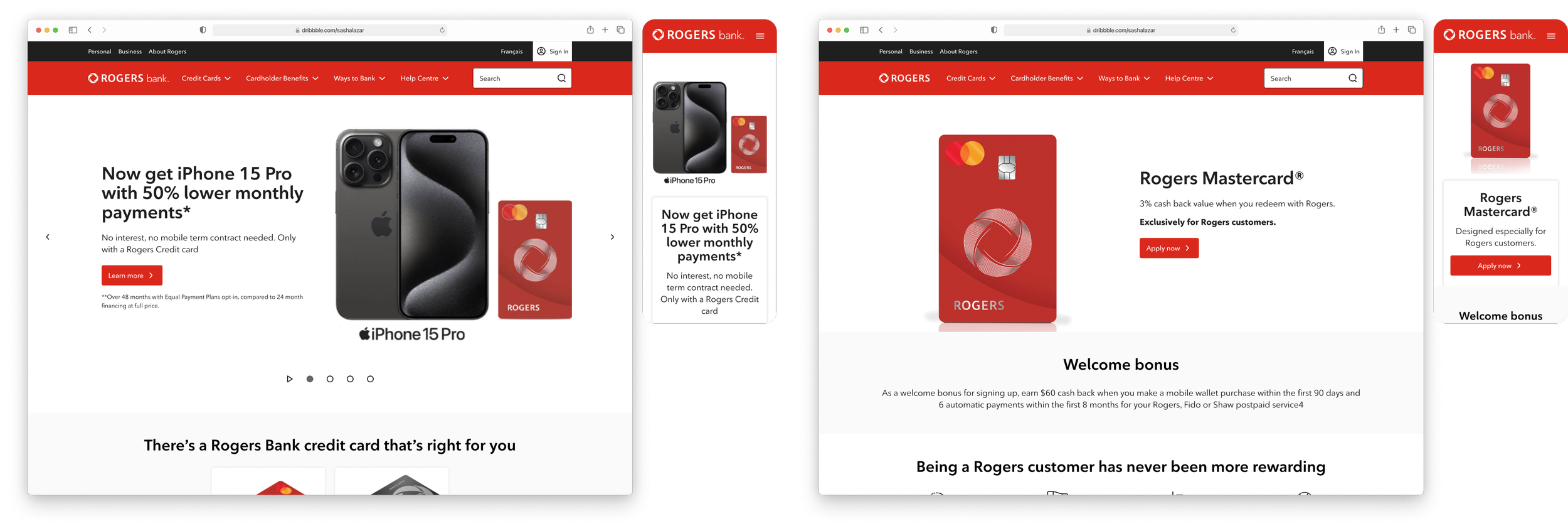
No major changes were made, but I introduced tiles with images to visually represent the credit cards, making them more appealing and actionable with clear calls-to-action.
Toward the bottom of the page, I updated the card features section. Instead of the tile-like components previously used, I followed the patterns of our Design System and implemented the value props component. This ensured consistency across the site while maintaining a clean and structured layout that highlights the card benefits effectively.
Product pages (Credit Card Pages)
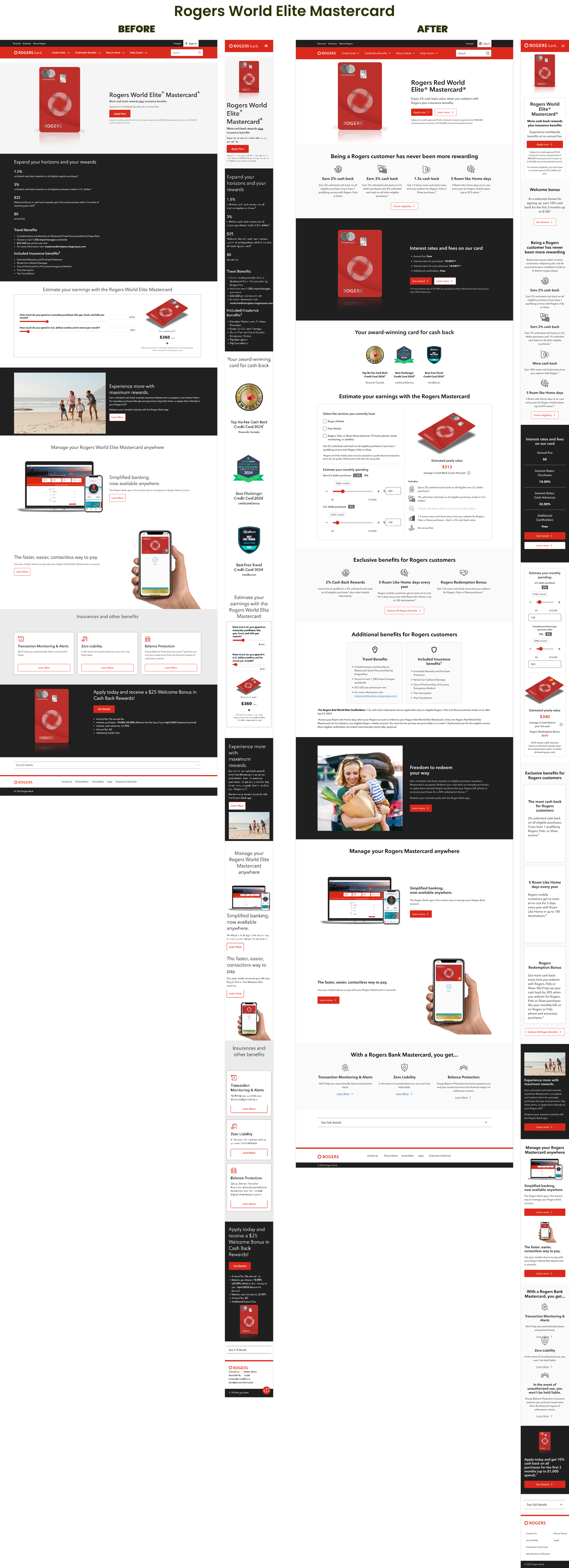
The product pages saw the biggest transformation. Originally, they lacked visual hierarchy, making it hard for customers to identify card benefits. I redesigned the pages to use the value props component to highlight cash-back rewards.
I also created a new credit card details component and moved the welcome bonus details to the top. After feedback from shareholders—who preferred alignment with competitors like Tangerine and PC Financial—I compromised by separating the welcome bonus into its own section. This approach prioritized clear rewards and fees, ensuring customers could make informed decisions.
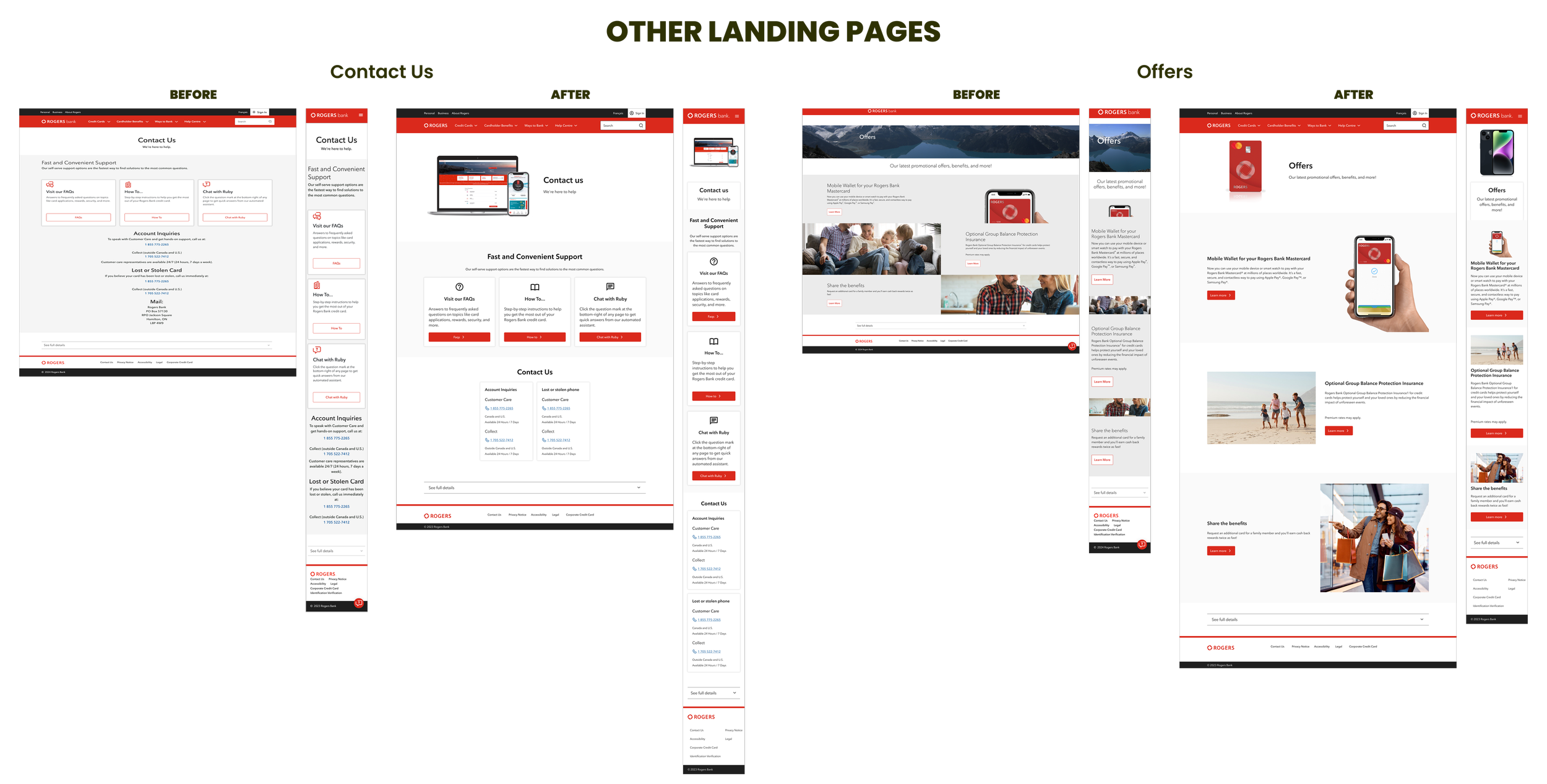
Landing pages
The landing pages primarily advertised the credit card benefits, with most pages presenting similar information but inconsistently. To address these gaps, I standardized around 85% of the content by:
Adding a hero section at the top of the page
Incorporating sections or tiles for clarity
Including FAQs to address common questions
Adding a bottom banner to incentivize card applications
While some pages required minor refreshes using Design System components, others underwent larger changes to achieve consistency and usability.
Mobile wallet pages:
These pages had broken mobile experiences, particularly with their instruction sections. I resolved this by replacing the outdated instructions component with the one from our design system, which is optimized for usability. I also incorporated icons to give the design a more approachable and user-friendly feel.
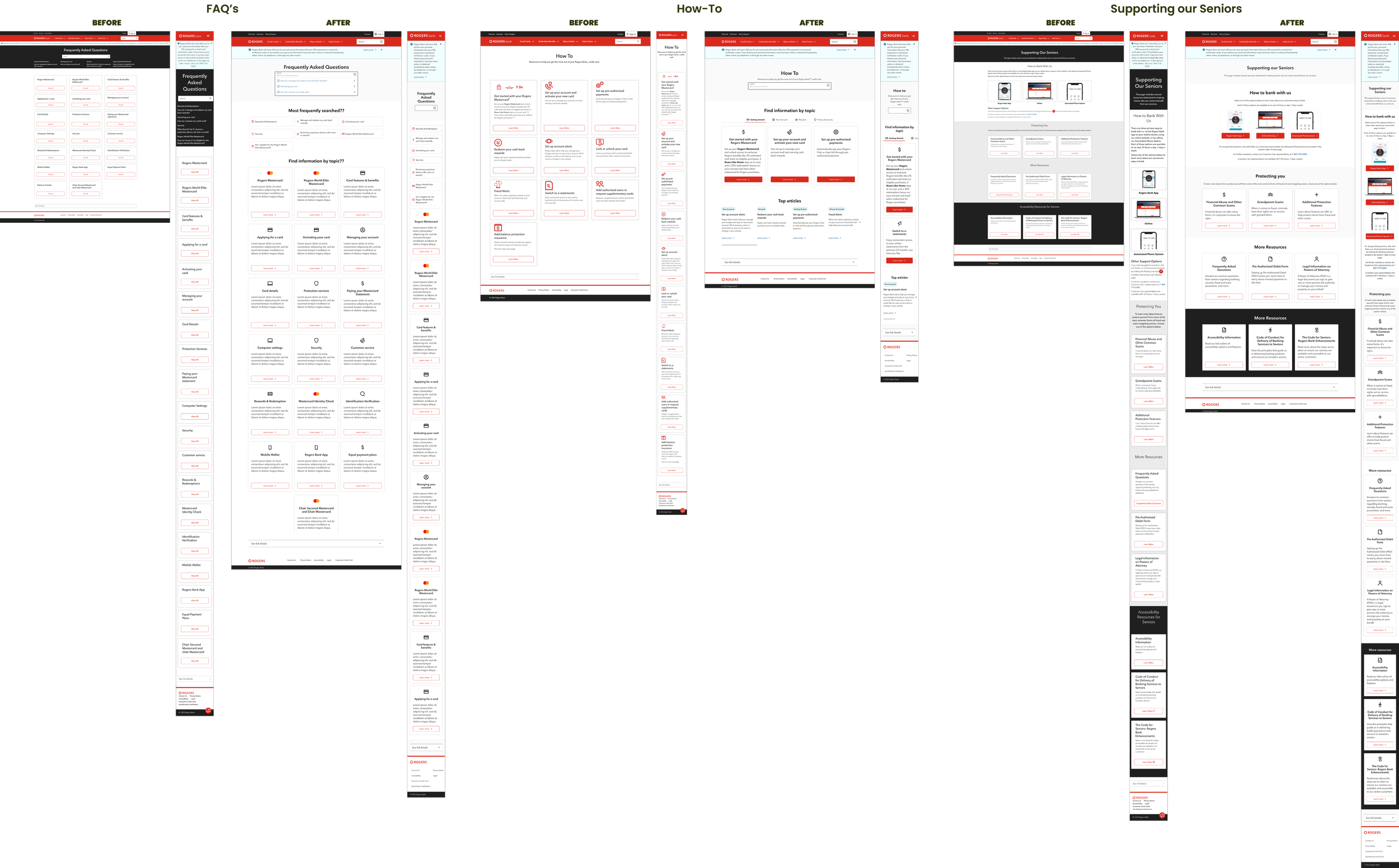
HUB pages
The HUB pages are a collection of article and FAQ pages, with only three pages using this template—all under the Help Centre:
FAQs
How To
Supporting Our Seniors
To improve readability, I removed the black background from the hero section on all these pages and replaced it with a lighter background.
I worked on standardizing these pages:
FAQs:
The page layout remains similar, but I removed the frequently asked topics and gave them their own dedicated section using the Chips component for better organization. I also updated the tiles for each topic to include icons, adding a more visually engaging and user-friendly touch.:
HOW TO:
I conducted competitor analysis by reviewing help centers from other banks and platforms like Airbnb. To improve the experience, I added a search functionality similar to the FAQ page, organized articles into categories, and introduced tabs to make it easier for users to find specific information. I also added a "Top Articles" section, akin to "most frequently asked questions," to highlight popular or important content, helping users quickly access what they need.
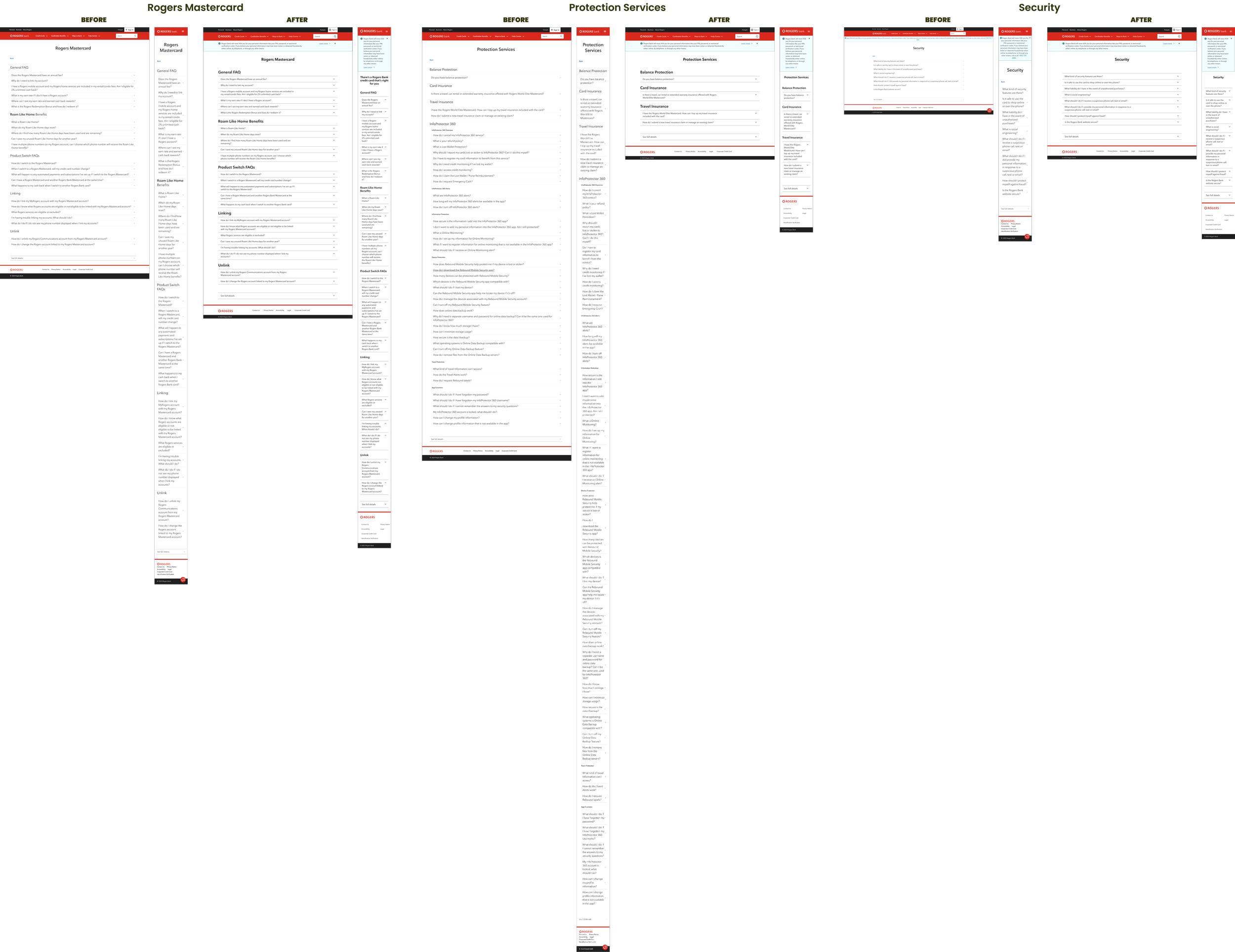
FAQ Pages
For the FAQ pages, the main change I made was removing the back button. This decision was based on the fact that users could land on an FAQ or article page via a Google search, making the back button unnecessary. This small adjustment helped streamline the navigation and avoid confusion.
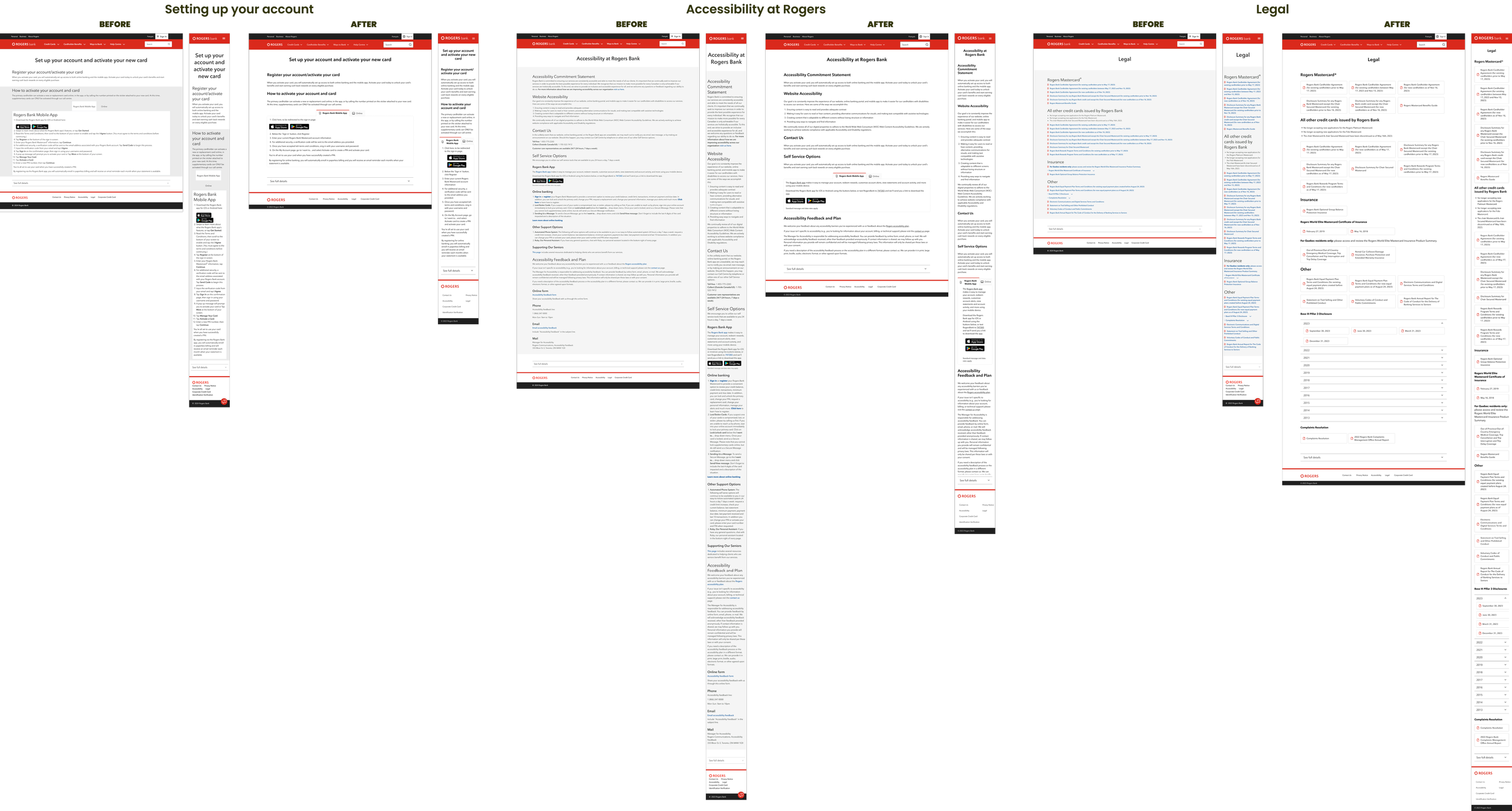
Article Pages
The main change I made was updating the background color to white across the page, which significantly improved readability. I found that my focus naturally shifted to the center of the page with the new background.
I also cleaned up the layout by incorporating elements from the design system, although the overall look remains quite similar to the original design. These changes were subtle but helped in creating a more streamlined, user-friendly experience.
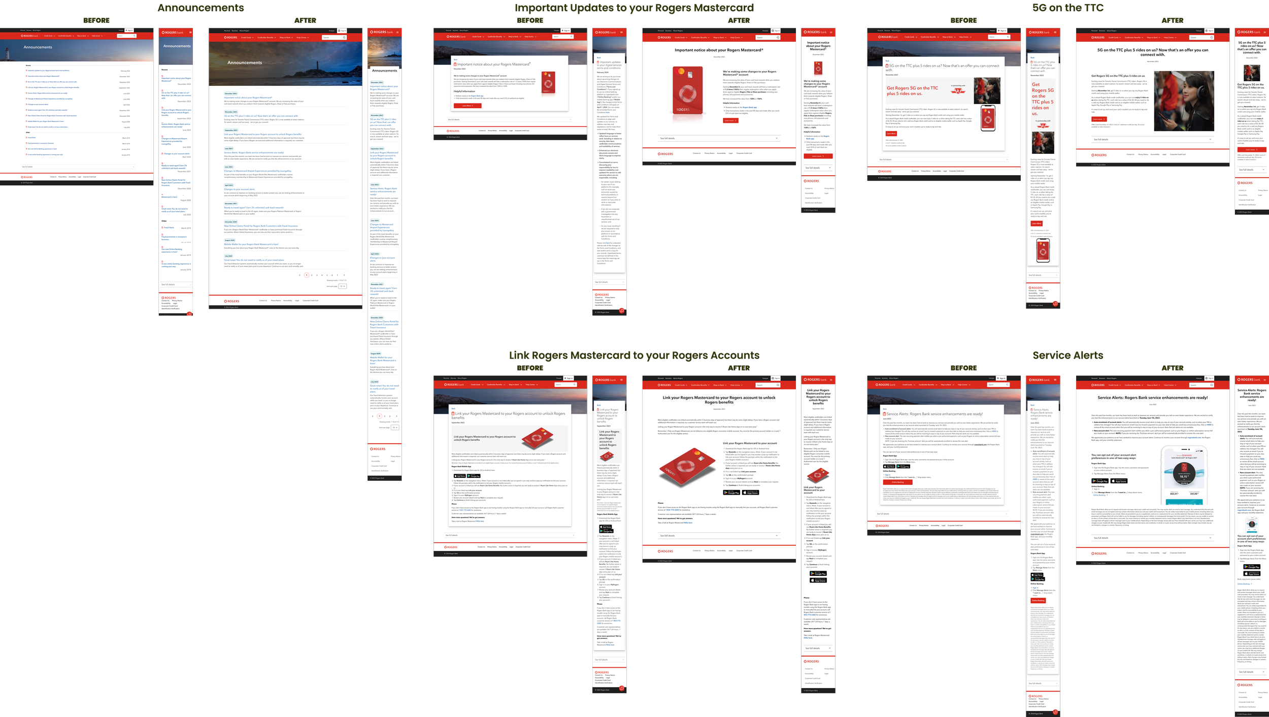
Announcement Pages
The announcement pages were a set of pages that needed to be standardized. Upon landing on the main page, it initially had a blog-like appearance, with announcements being posted frequently—whether monthly or at varying intervals. The announcements landing page was very similar to the search page created for Rogers Bank, while the individual announcement pages resembled article pages.
NEW COMPONENTS
Content Block
The content block wasn’t necessarily a completely new component, but it was introduced as a new content type in Contentful, the CMS platform used for publishing Rogers Bank content. To provide content writers with more flexibility, the content block utilizes the Rich Text editor, eliminating the need to create an entirely new component, which saved developers time. The properties of the content block included:
Title
Body (copy + images)
CTA
Earnings Calculator
The earnings calculator component was created and it’s tool on the credit card pages where customers are able to estimate their yearly earnings based on spending. By enabling the following current components from the Design System, we created the calculator:
Picture
Value Props (secondary variant)
Checkboxes
Label
Slider
conclusion
5
CHALLENGES
Some challenges I had faced from this project were that there wasn’t any user testing; the project mainly relied on getting approval from the shareholders. The timeline was tight—less than a month to finish most pages, with bi-weekly deadlines for any requested changes from shareholders.
I leaned on support from the Design System’s technical lead, who provided invaluable feedback regarding capabilities of components in the Design System. While creative freedom was limited due to adhering strictly to the design system, I saw it as an opportunity to enhance my problem-solving skills within structured constraints.
REFLECTION
While I initially thought I understood our design system and its patterns, this project deepened my knowledge, especially regarding spacing and proper component use. As a former developer, I worked closely with the development team, organizing and presenting information to simplify their workflow.
As a newer designer, tackling my first major project, I’m thankful for the design system. The shareholders were open to changes after I explained my rationale and showcased multiple mock-ups to highlight the best solutions.
If you would like to check out the full re-design, check out Rogers Bank.

